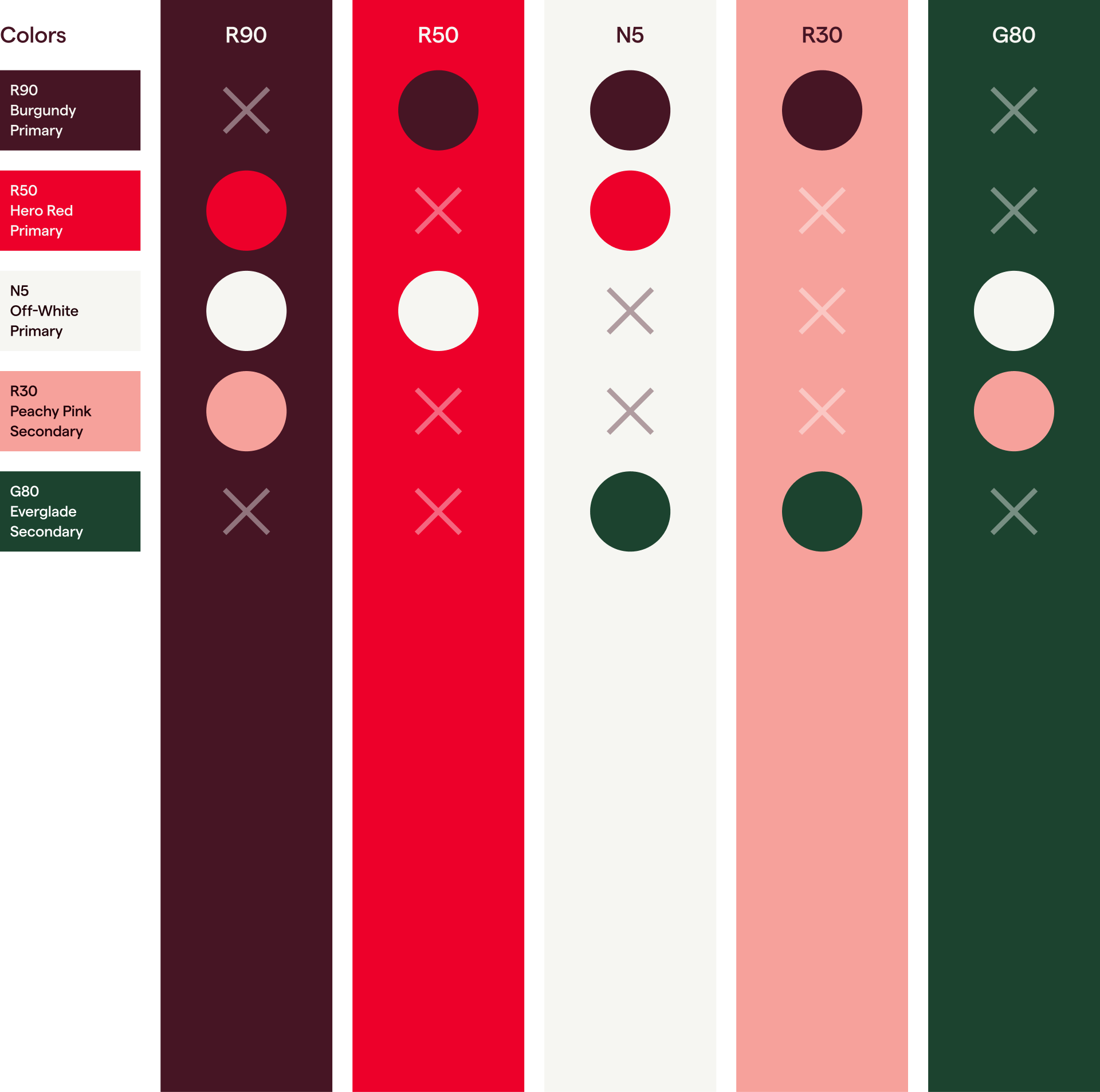
Vill du byta språk?

Visual identity

Colours

Colours are crucial for Trapets' brand identity. They help create a recognisable and memorable visual presence and differentiate our brand from competitors. Consistent use of colours can enhance our brand recall and establish a strong connection with our audience.

Brand colours

Primary colours

Our primary brand colours are Burgundy, Off-White and Hero Red

They provide accessibility, simplicity, and consistency throughout all brand communications. 

Combining these three colours should always be represented in all our communications.

Trapets brand colour: burgundy.

Primary

Burgundy

Burgundy works as a confident backdrop to all our communication. Most of our communication uses ‘dark mode’ as default, feeling bold and embracing.

Always aim for Burgundy to be the dominant colour and let the other colours pop to highlight important content.

HEX #461524
RGB
70, 21, 36
CMYK
45, 90, 49, 71
PMS
-

Trapets brand colour: off-white.

Primary

Off-White

Off-white is an integral part of our colour palette as it gives other colours space to breathe and creates contrast and clarity. Off-white is mainly used as text colour on Burgundy or darker backgrounds. 

Off-White can also be used as a background colour to vary the layout of a web page or presentation.

HEX #F6F6F2
RGB
246, 246, 242
CMYK
-
PMS
-

Trapets brand colour: hero red.

Primary

Hero Red

Red is an important colour that is unique to Trapets. It reflects the robust, trustworthy and passionate part of our personality. Hero Red should be used sparsely and primarily for drawing attention as a call to action.

HEX #ED002B
RGB
237, 0, 42
CMYK
0, 98, 80, 0
PMS
206 C

Usage proportions

It's essential to follow the rules of these proportions when creating brand communication to maintain brand consistency and remain accessible to everyone. Burgundy plays a vital role in all brand communications and should provide balance with Off-White.

Colour usage proportions

Secondary colours

Our secondary brand colours are Everglade Green, Light Grey and Peachy Pink.

These colours are mainly used as accent colours to create diversity around an image.

Trapets brand colour: light grey.

Secondary

Light Grey

Light Grey is mainly used for similar purposes to the primary Off-White colour. 

It helps create contrast and clarity where Off-White doesn't suffice.

HEX #EBEBE8
RGB
-
CMYK
-
PMS
-

Trapets brand colour: peachy pink.

Secondary

Peachy Pink

Peachy Pink is mainly used as a text colour on a dark background, but it can sometimes also be used as a background colour. 

Peachy Pink is generally used instead of Off-White to create vibrating text and add a touch of colour when needed.

HEX #F6A19B
RGB
-
CMYK
-
PMS
-

Trapets brand colour: everglade green.

Secondary

Everglade Green

Everglade Green works mainly as a complementary colour for the previous secondary colours. 

Although not used very often, Everglade Green offers a natural, tone-down accent to texts when used instead of the primary colours.

HEX #1C432F
RGB
-
CMYK
-
PMS
-

Colour pairings

Our primary palette works very well together. Each colour has its own space and complements the others well. 

Always make sure to have enough contrast between background and foreground colours.

R90 Burgundy and N5 Off-White mainly work as foundation colours, whereas R50 Trapets Red is a prominent call to action.

Colour pairings

Extended palette 

To create a flexible visual identity, we have developed extended palettes around our primary colours. These colours can, for example, be used in user interfaces, diagrams, etc., when we need to be able to create a variation or ensure contrast but still stick to a uniform visual expression. Don't misuse these colours; follow guidelines, and return to our primary colours when in doubt.

The neutral scale is the foundation for our digital products for backgrounds, text colour, shadows, static elements such as dividers, etc.
To meet the requirements and limitations of the digital environment, we have expanded the Trapets brand colour core palette by incorporating semantic colours and increasing the range of available colour scales.

Extended palette
Extended palette