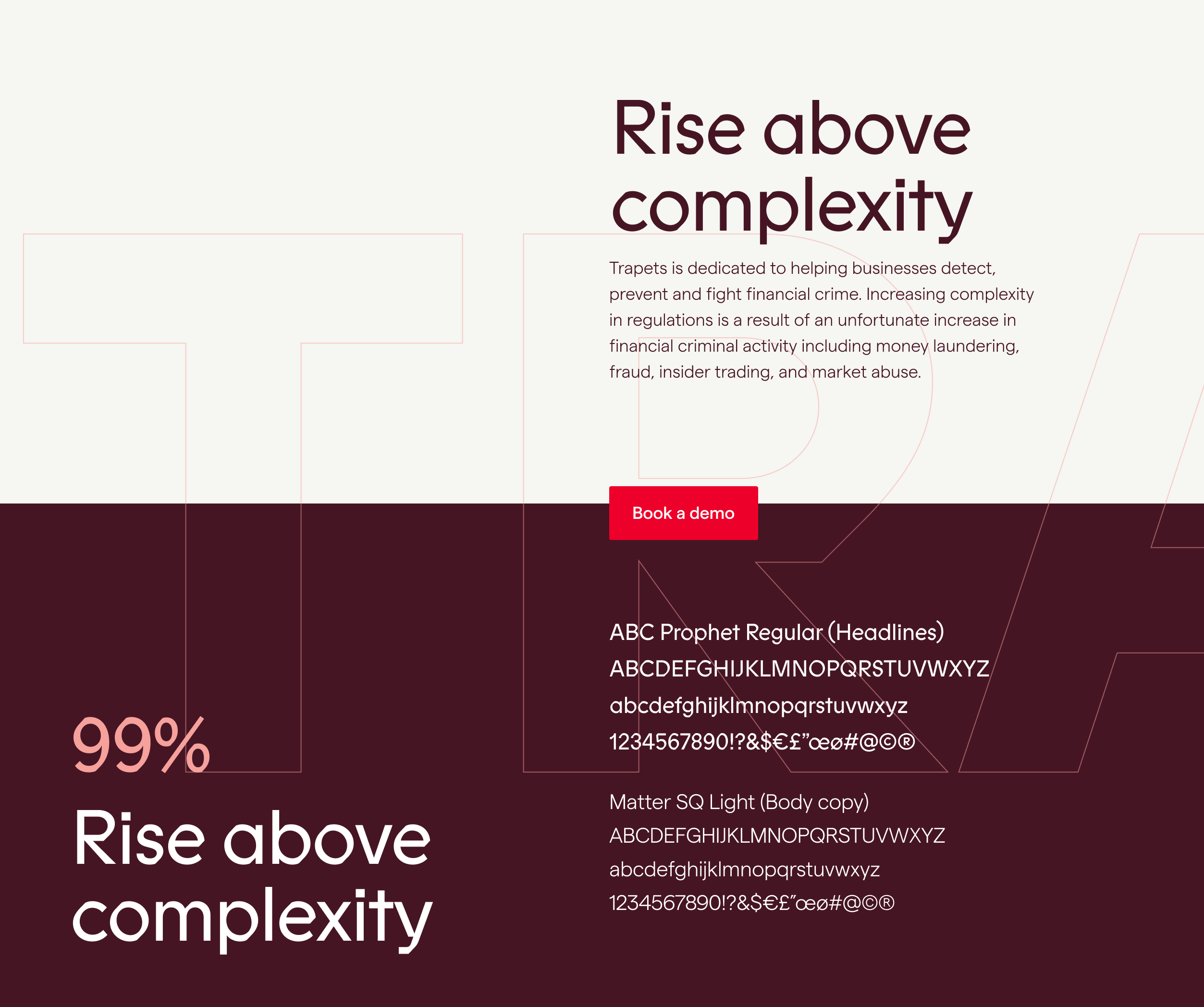
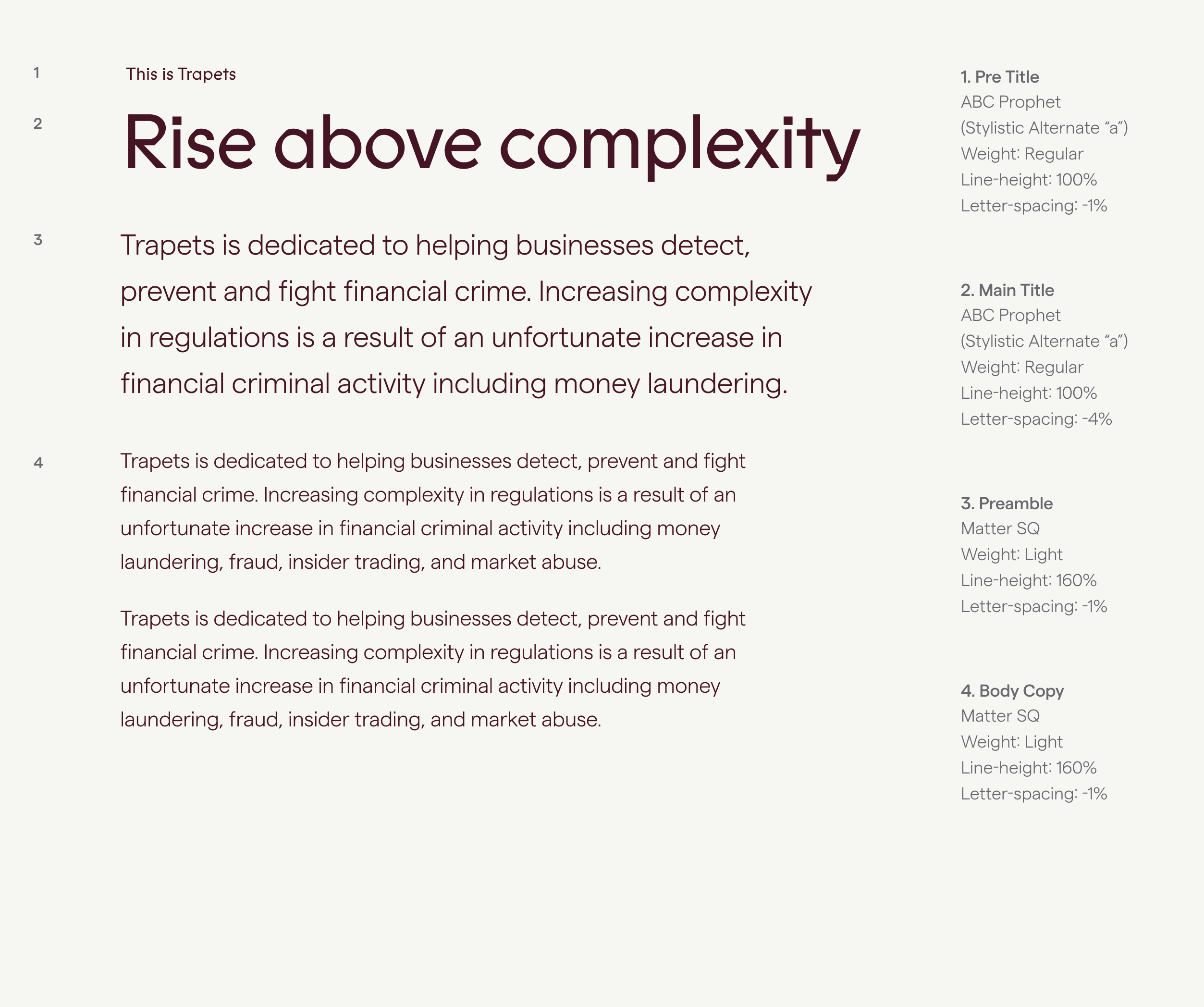
Vill du byta språk?

Visual identity

Typography

Typography is more than just choosing one or two fonts. It's about creating a visual language communicating the Trapets' essence and values. To represent our brand, Trapets used two fonts: ABC Prophet for titles and Matter SQ for body text.

Our typefaces

ABC Prophet is used in headlines and combines warm calligraphic curves with a clean, machine-like sensibility—bridging the hand-drawn and mechanical genres.

Matter SQ is used in body copy and user interfaces. Matter is a grotesque typeface with a subtle, warm touch.

Weight

ABC Prophet Regular is used in headlines. Matter SQ Light is used in the body copy. The medium weight is used for emphasizing.

Size

We are using size to differentiate various texts. Make sure headlines are bigger than the body text, for example. More extensive text generally attracts more attention, so make it short and concise.

Typography size

Examples

Here are some examples of the typefaces in action. Generally, we’re using bigger, tighter headlines and more legible space for paragraphs. Notice that lowercase “a” uses the alternate single-story version. Text is primarily set in “Burgundy” (R90) on light backgrounds and in “White” (N0) on darker backgrounds.

Example of typefaces

Fallback

Since ABC Prophet is a strong brand carrier, it should be applied whenever possible within our organisation.

However, when there is the need for a system font which requires no special license and is available on all computers, our fallback choice is Arial.

Typography

Download the fonts

To install the fonts on your computer, download the files, click on the OpenType font file format documents and press "Install". To get a detailed tutorial, click on the button "How to install the fonts" below.